
It’s becoming increasingly important to have a strong brand that rises above the crowd. Good branding is no longer optional. In fact, 48% of consumers report that they are more likely to become loyal to a brand during the first purchase or experience. But what is a brand?
A brand creates an expectation and an emotional reaction in your prospective clients.
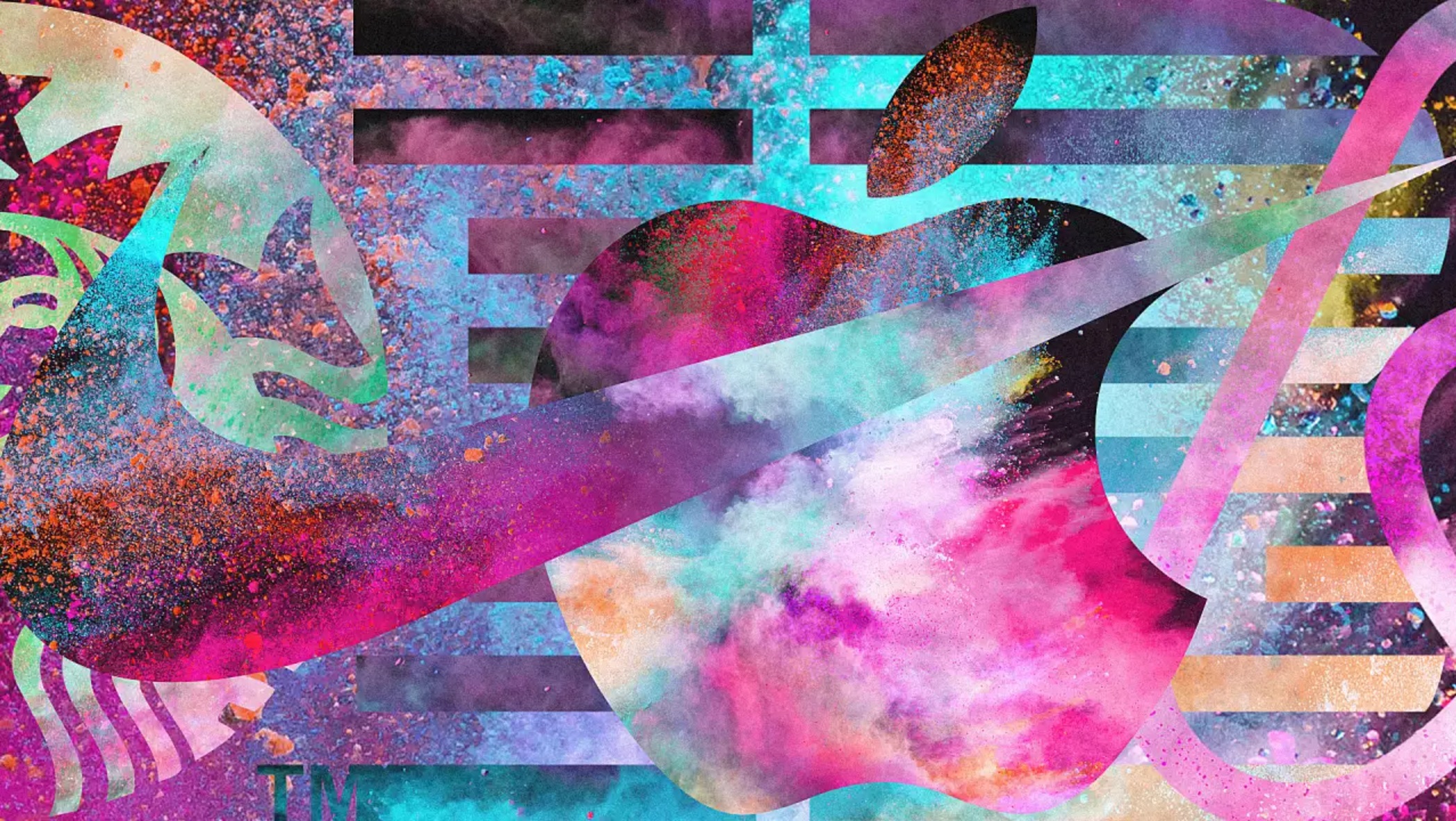
Think about the brands you most admire. When you see the names and logos of Apple, Tesla or Nike, what expectations do you have about their products (even those you haven’t yet seen or touched)? What emotional reaction do you experience when you see the names and logos of other brands you respect and love? What emotional reactions do you experience when you see the names and logos of brands you strongly dislike?
Branding is the way that we communicate with consumers, differentiate from our competitors, and create a name for ourselves in a world full of great ideas. Some business owners think that branding isn’t important as long as they deliver great customer service or have great products or services. This is rarely the case. There’s too much competition and too many great products and services. Great branding is a differentiator.
You have 50 milliseconds to make a good impression on your potential customers, and quality design will play a major role. A memorable logo doesn’t just help customers create a relationship between your company and its services, it can actually make them more engaged.
A study conducted by branding firm Siegel+Gale found that memorable logos are 13 percent more likely to get consumers’ attention, 7 percent more likely to make them want to learn more about the brand, and 6 percent more likely to suggest a company is more unique than others in its category.
I asked a few top logo designers to come up with their most essential elements of a great logo. Here’s their advice:
A logo should be strong and balanced.
A logo is just text, just a graphic symbol, or both of those elements. It should reflect your company – its heart and soul – its personality. Keep your audience and products/services in mind because you want your logo to reflect your business. Favor logos that have a strong, balanced look so that they are easy to read and attract attention.
A logo should be simple.
Simplicity is vital. A complex logo will be difficult to print and reproduce and may not fully engage your audience. Take a moment and think about brands that are successful and/or famous. Most likely, you’ve thought of companies like Apple, Facebook, and McDonald’s. What do those brands have in common? They all have logos that are simple and easily recognized when printed by themselves, and when printed in solid black and white.
A logo should be memorable.
Your logo does not always need to describe what your business does. Have you ever seen a car manufacturer with a picture of a car as their logo? How about a shoe manufacturer? It would look silly to have a picture of a shoe… on a shoe.
When using icons in your logo design, consider icons that could communicate your brand without the company name. This will allow you to use the icon as a stand-alone image (on product packaging, for example).
If you look at the white space between the “E” and “x” you can see a right-facing arrow. This “hidden” arrow was intended to be a subliminal symbol for speed and precision. The Nike logo, the iconic “swoosh”, is meant to suggest movement, because it represents the wings of the Greek goddess of victory, Nike.
A logo should be flexible.
A logo should be visible and distinguishable on a big billboard from 100 meters away or 20 millimeters away. It should also work well in different size formats, including on business cards, brochure, t-shirt design and other marketing materials such as embroidery, stamping, embossing, etc.
A good logo will work well in many colors and in just one or two colors (yes, black is a color). A good logo will work well on light backgrounds as well as dark backgrounds, and even on multicolored backgrounds.
Be sure that you use your logo consistently and be sure that your logo allows you the flexibility to do so in multiple formats.
Use Appropriate Colors.
If you are looking for a color logo, consider the psychological messaging that color sends to your customers. Do the colors reinforce and strengthen the intended core message/personality/mood you’re trying to communicate through the logo, or do they distract or neutralize?
For example, blue often communicates trust, loyalty and freshness. The color blue is common in banking or finance. Green represents life, nature and cleanliness. Also consider colors that work well with dark and white backgrounds. Because logos are often printed in black and white, chose a logo design that is viable and as strong or stronger in black and white.
Avoid too much complexity. For example, although gradients provide an aesthetically-pleasing effect on computers, consider possible future uses of the logo for materials like letterhead, business cards, and merchandise. Will the logo provide ease of printing and reproduction in and on all types of media? A logo for a website or a band, or a one-off project can be more rasterized and colorful than something that’s going to be printed in many different ways.
Think twice about including more than 3 colors in a logo – too many colors will increase the cost of production when printing and may make the logo more difficult to reproduce. Although such costs have decreased considerably, this remains sound advice. If you plan to scale your business to span geographic boundaries, you should also consider cultural differences when creating your logo.
A logo should be timeless.
Trends are good but innovation is better. Fads are often deadly. A logo should have a long life expectancy. It will evolve and change over time, but the longer it stays the same at its heart, the better brand recognition you will get over time. (Examples: Coca-Cola, Apple, BMW). A good logo will have a sense of timelessness about it. A logo that feels anchored in a certain time period is more likely to feel outdated or need substantial repurposing fairly quickly. The best logos change very little yet feel fresh and vibrant every time.
A logo should be unique.
Will it stand out among the clutter and the crowd? Does the symbol or icon distinguish itself in a unique way from the competition, or is it predictable and bland — and thus unmemorable and ultimately invisible to the intended audience?
With thousands upon thousands of fonts, billions of color combinations, and an infinite flow of design ideas, choose the logo that is the most unique.
Try to avoid common logo clichés like “swoops,” “wooshes,” and “pinwheels;” these techniques are perhaps the most commonly used practices in the logo industry (just look around your house, you’ll see). Avoid clip art like the plague, unless it’s significantly modified by the artist. It’s quite disturbing when you start noticing your logo, and things that look like it on many other people’s brands. That’s the quickest way to look lowbudget and second-rate.
A logo should have strong typography.
Typography is important. Typefaces with serifs convey a sense of dignity & power while sans-serifs are often more clean-looking and offer either a sense of stability or whimsy, depending on the character of the typeface. Will the typeface work with what you currently have? Can the logo be read at small sizes? Is the letter spacing/word spacing well adjusted? The larger the wording gets, the more obvious the flaws will be.
Typography is a craft in itself. It’s the first voice of stating who you are. Beware that there are some truly horrible typefaces out there. Make sure that you’re getting your money’s worth.
Your logo has to derive meaning from your brand, not the other way around. The world’s best brands are not well-known because of their logo, they are known because of the people and vision that the logo represents. It doesn’t hurt that they spend millions or billions of dollars annually on marketing and advertising. When deciding on the direction of your logo, make sure that you have already thought about your brand and the direction of your company. This guide on building your brand identity from the ground up is a good start.
Your logo should derive meaning from your brand.
Your logo has to derive meaning from your brand, not the other way around. The world’s best brands are not well-known because of their logo, they are known because of the people and vision that the logo represents. It doesn’t hurt that they spend millions or billions of dollars annually on marketing and advertising. When deciding on the direction of your logo, make sure that you have already thought about your brand and the direction of your company. This guide on building your brand identity from the ground up is a good start.
Make sure your logo is vectorized.
Whether you work with a friend or an agency, always request vector-based graphics when you buy a logo design. A JPG, GIF, PNG or PSD isn’t going to cut it. A properly drawn vector design will provide you with the ultimate flexibility to use your logo in different ways and in different sizes.
You only get one chance for a first impression, so make it a good one.